Overview
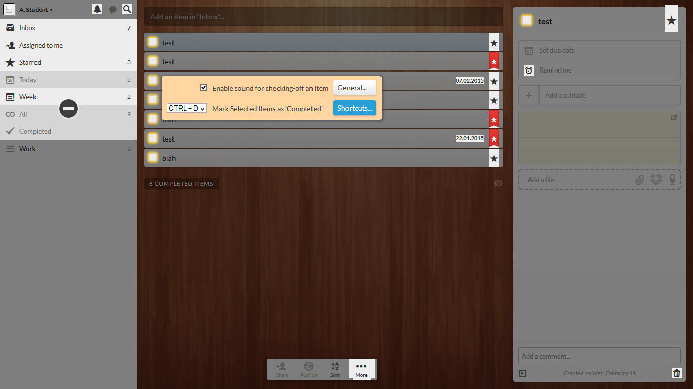
The settings panel is the standard customization mechanism used in software applications today, yet it has undergone minimal design improvement since its introduction in the 1980s. Entirely disconnected from the application UI, these panels require users to rely on often-cryptic text labels to identify the settings they want to change. Instead, we propose the Anchored Customization approach, which overlays settings directly on top of the application interface. Users can see which UI elements are customizable, and access their associated settings.
Process
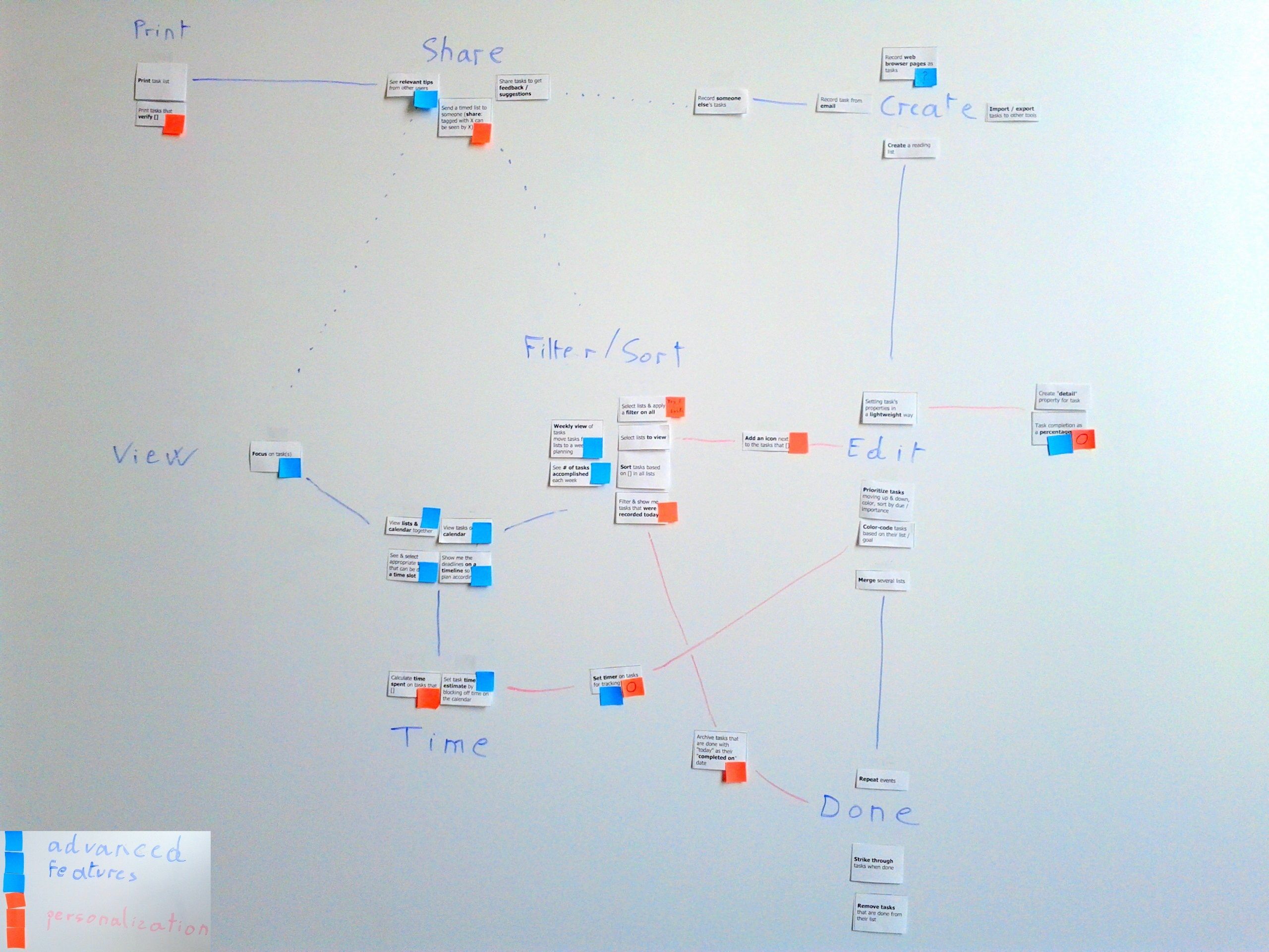
I started by surveying a large number of apps, both on the desktop and on smartphones, to see which customization mechanisms are offered to users today. I found that most apps implement a very similar settings panel, with many checkboxes and drop-downs. Unfortunately, these panels have serious usability shortcomings: they don't provide affordances, preview, or undo.

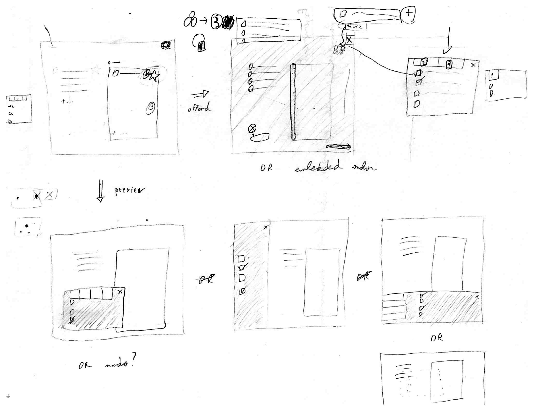
To address these shortcomings, I had the idea of letting users change directly the app interface. After surveying another set of apps to verify that this approach was feasible, I designed a direct customization mechanism that maps settings to visual elements in the interface.


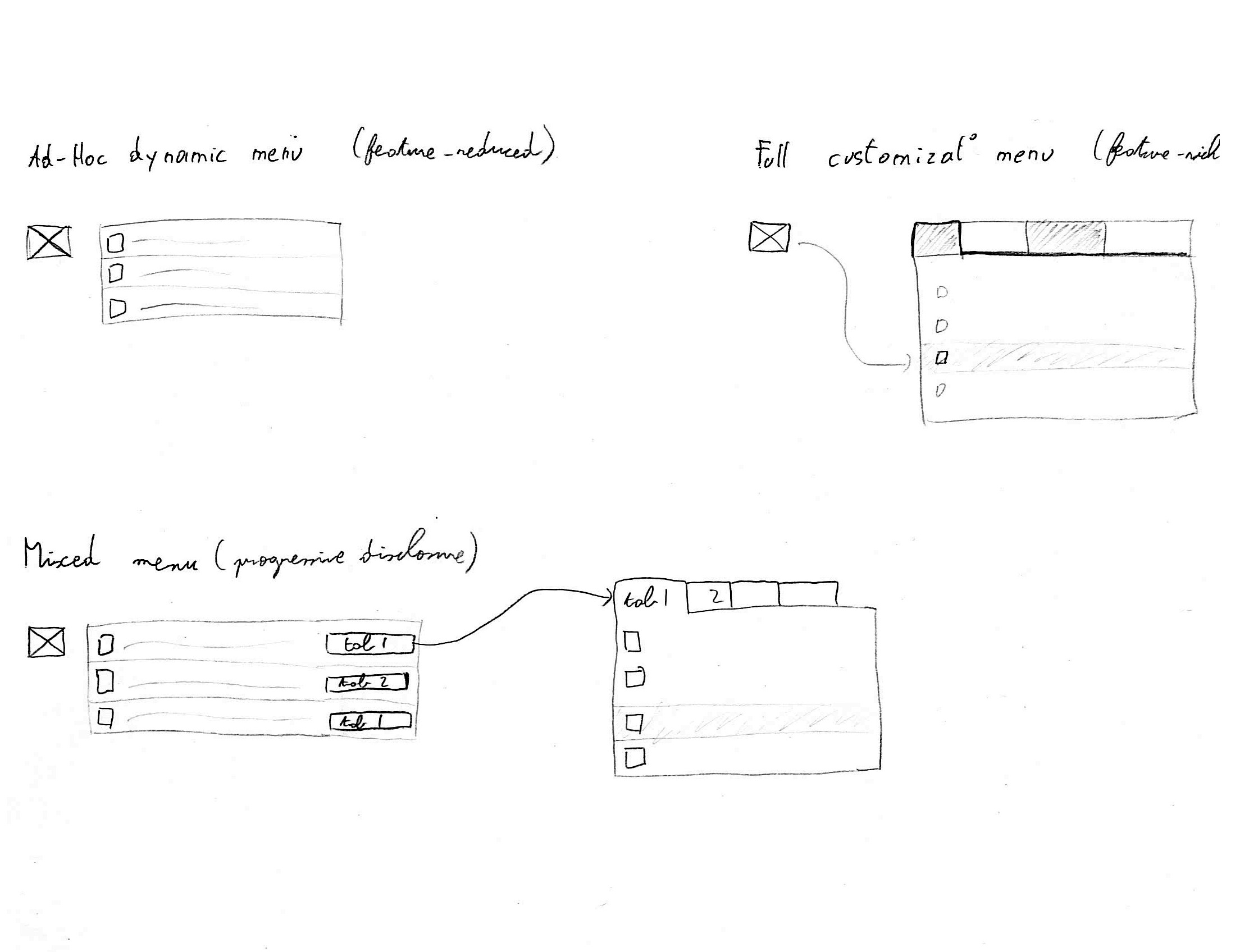
I built a web prototype in Angular.js with several variants, testing and refining them regularly with users. I managed to hook this prototype into Wunderlist, a popular task management app, replacing their settings panel with my software. I used this setup to run a remote usability study, recruiting participants on Amazon Mechanical Turk. It showed that two of the three variants tested were 35% faster than Wunderlist's settings panel.
