Overview
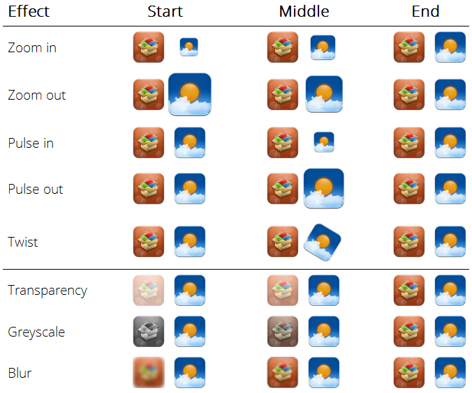
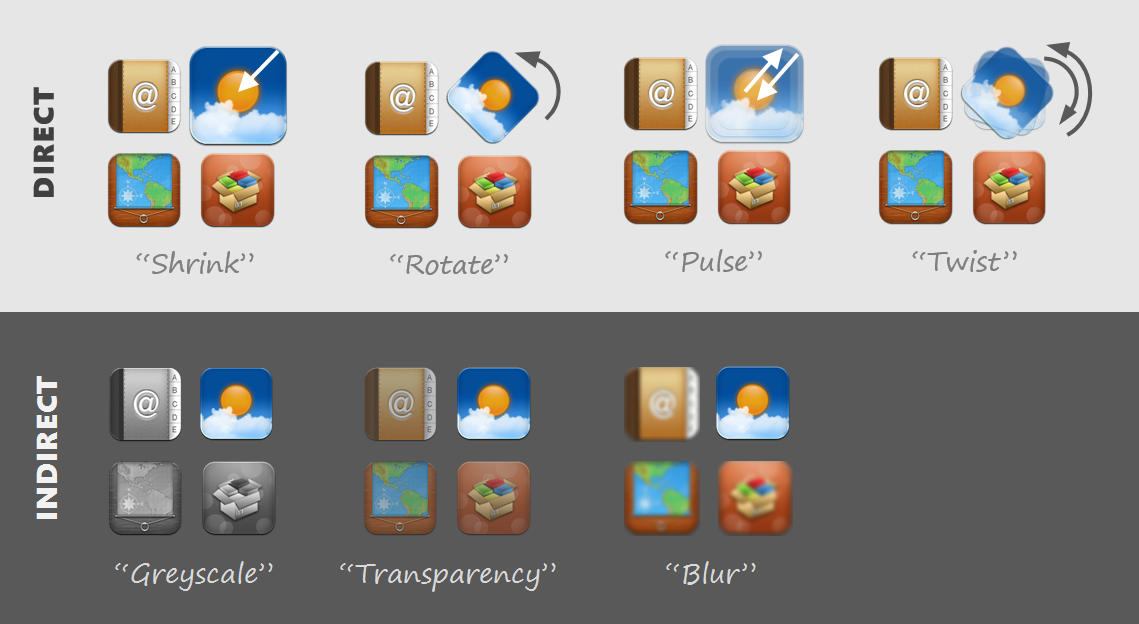
The concept of ephemeral adaptation was introduced to reduce visual search time in GUI menus, while preserving spatial consistency and minimizing distraction. We extend this concept to the visual search of app icons on smartphones in order to speed up launching apps from a homescreen. We created ephemeral highlighting effects based on preattentive visual properties including size, orientation, color, opacity and blur. A controlled experiment showed that Twist (icon rotates back and forth) and Pulse (icon grows and shrinks) improve search time performance by 8-10% over a control condition with no highlighting.
Process
To find inspiration on new ways to launch apps on smartphones, we surveyed many custom Android homescreens and themes, looking at the type of icons, widgets and animations they were using. Given the growing number of apps that people install on their phone, we decided to focus on helping users find the app they're looking for faster.

We prototyped some visual effects with PowerPoint, but quickly realized that we needed more power and control on the animations. We then built an Android app mimicking a traditional homescreen, with a variety of highlighting effects that we tested on potential users. Finally we designed and ran a controlled experiment on the two most promising effects.
