Problem
The literature review is a key component of academic research, that allows researchers to build upon each other’s work. Modern search engines enable fast access to publications, but there is a lack of support for filtering out the vast majority of papers that are irrelevant to the current research focus.
Outcome
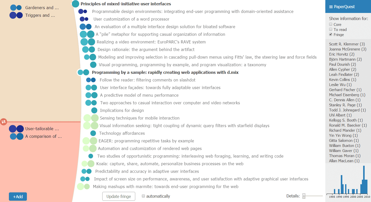
PaperQuest is a visualization tool that supports efficient decision making, by only displaying the information useful at a given step of the exploration process. We created a relevance algorithm to find and sort papers that are likely to be relevant to users, based on the papers users have expressed interest in before and the number of citations. The current implementation uses papers from the CHI and UIST conferences, and citation counts from Google Scholar, but is easily extensible to other domains of the literature.
Process
We began by asking researchers how they do literature reviews, and we found that most were following a very similar process: searching with keywords on Google Scholar, opening papers links in a new tab, reading the abstract and, if the paper seemed interesting, downloading the pdf for reading it later.
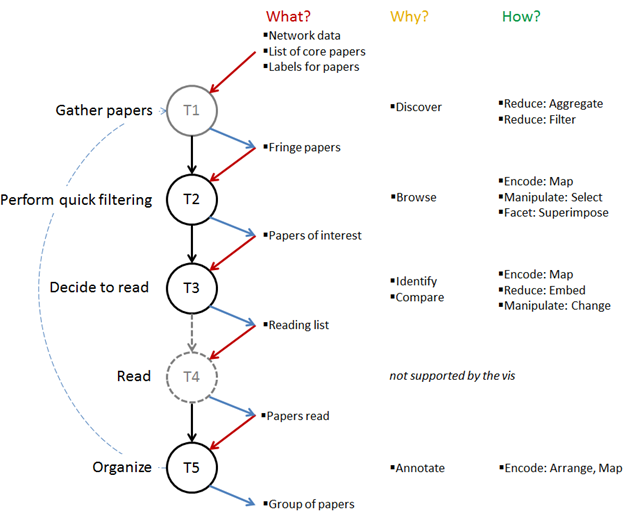
Our goal was to support this lightweight decision process, but make it more powerful by leveraging previous searches and selected papers. Our most important decision was to represent the papers network as a zoomable and ordered list, instead of a traditional node-link diagram. We iterated extensively on: the overall layout of the visualization; the visual encoding of the paper metrics; and the browsing interactions. My friend Pax worked on retrieving the data, processing it and serving it in an Object-Oriented way, while I focused on the UI and the interactions.